Designing our first war graves
Fabian Ware and his team believed the war cemeteries should have consistent features that distinguished them from their civilian counterparts. However, what those features should look like – and even be called – was hotly contested.
THE HEADSTONE
The most crucial decision was that headstones should have a uniform appearance. A Headstone Committee was set up that included the Principal Architects and operational staff, as well as the graphic designer Leslie MacDonald Gill and the Director of the National Gallery, Charles John Holmes. Different shapes and spacing options were discussed, as shown here.
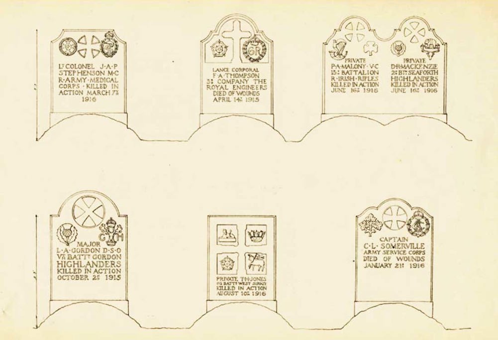
Specimen designs sent out by the Commission to the colonels of all regiments to ask their opinions, Jan 1918. © CWGC.
Edwin Lutyens and Herbert Baker both submitted designs. Baker suggested heraldic shields as an adornment, wanting to associate the First World War with the medieval Crusades. It featured a complex colour-coded system of bars, chevrons and symbols to mark years of service, wounds and awards.
In the end, a simpler design was chosen that reportedly resembled Lutyens’ proposal (drawings of which do not survive). The rounded shape was intended to be neutral, allowing for the commemoration of all faiths and nationalities.


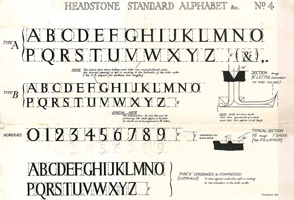
Leslie MacDonald Gill created a unique upper-case typeface for all headstone lettering.
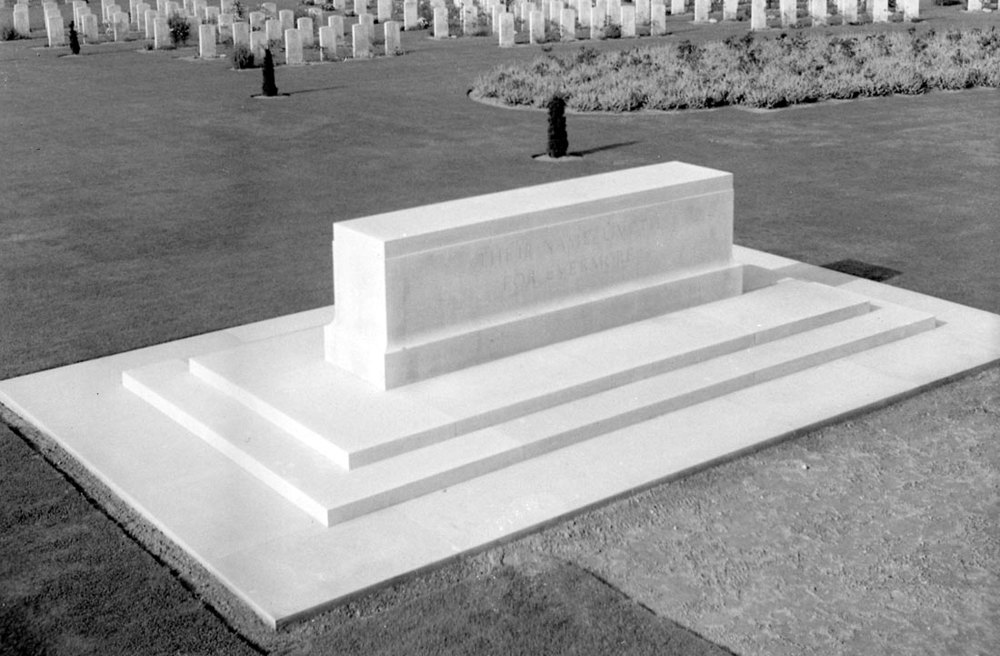
THE STONE OF REMEMBRANCE
The Commission felt that there should be some kind of commemorative focal point in its cemeteries to tie the multitude of graves together as one shared sacrifice. Lutyens was keen for this to be a universal or non-religious symbol to which people could attach their own meanings. He considered a solid bronze ball and a regularly-chiming bell, before conceiving the now-familiar stone block as a kind of secular altar.
But no one quite knew what to call it or what to inscribe on it. Lutyens wanted “one thought in clear letters so that all men for all time may read and know the reason why these stones are so placed throughout France”. The original suggestion was “Their bodies lie buried in peace; but their name liveth for evermore”(Ecclesiasticus 44:14), intended to run continuously round the stone above a large ‘AMEN’. However, as Lutyens’ letter explains, the full quote was too unwieldy to be effective.
Lutyens also considered many possible names for the stone. He listed them in a letter to Ware, calling it his “stoneology”. Options included “The Battle Stone”, “The Stone of Peace”, “The Stone of Pity”, “The King’s Stone” and “Our Stone” – all conveying quite different messages and tones. Interestingly, the name that was finally chosen was not on the list.
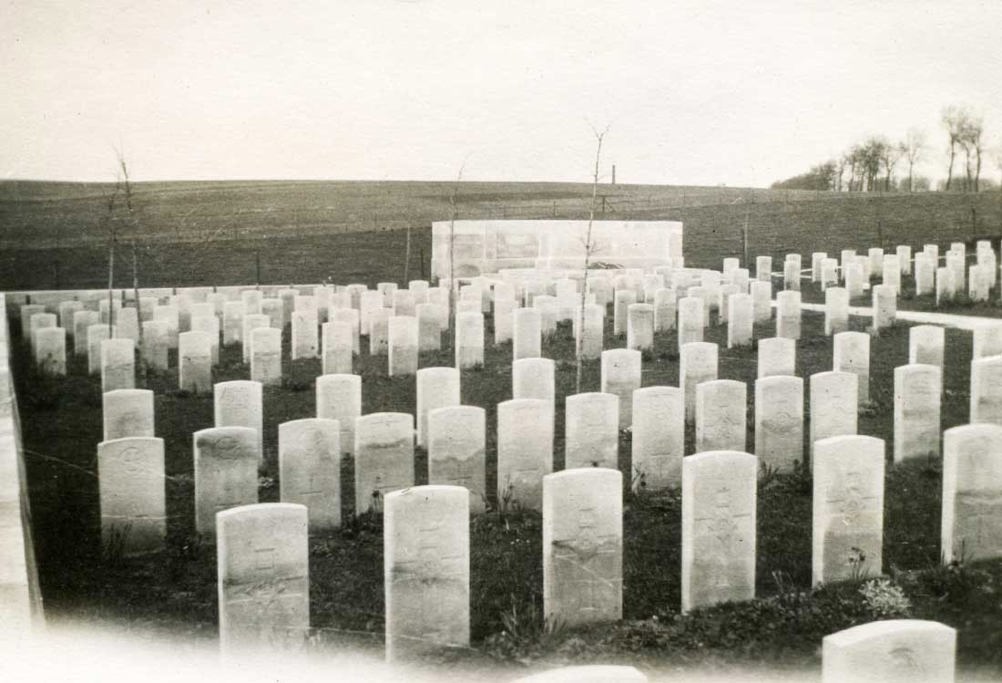
Jonkerbos War Cemetery Holland. Stone of Remembrance with cemetery in the background. © CWGC.
The seemingly-simple Stone of Remembrance actually uses an ingenious architectural technique devised for Classical temples. Known as entasis, the Stone’s edges are subtle convex curves that create an optical illusion of imposing scale and strength.
THE CROSS OF SACRIFICE
There was concern, especially amongst Church of England clerics, that the stone of Remembrance was too secular. So the Commission devised the ‘Cross of Sacrifice’ for majority-Christian cemeteries. Baker and Lutyens produced similar designs based on typical medieval crosses in English country churchyards. Baker featured a bronze longsword on the front, which he named the ‘Ypres Cross’; it was engraved with a small bronze image of a sailing ship, symbolising the Royal Navy’s role in winning the war.
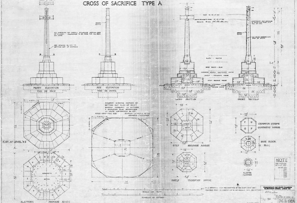
Diagram of Reginald Blomfield’s Cross of Sacrifice. © CWGC.
Blomfield bluntly said of his colleagues’ efforts: “runic monuments or gothic crosses have nothing to do with the grim horrors of the trenches”. He produced a more dramatically simple design with prominent cross-arms. Like Baker, he incorporated a bronze sword called the ‘Sword of Sacrifice’, but he wrote that its meaning was pointedly “abstract and impersonal”. He wanted to avoid the “fripperies” and “sentimentalities of Gothic”: “I hoped to get within range of the infinite in this symbol of the ideals of those who had gone out to die”. Blomfield’s design was ultimately chosen, and would become a model for local war memorials across the UK.
“To some, it is a Christian cross: to others, the stone is irrelevant and the sword itself is the cross; and to others, the artwork symbolises those who sacrificed their lives to the sword.”
Fabian Ware on Reginald Blomfield’s ‘Cross of Sacrifice’, 1924


Creating a unified vision
The man tasked with bringing disparate designs and personalities into one coherent whole was the Director of the British Museum, Sir Frederic Kenyon.
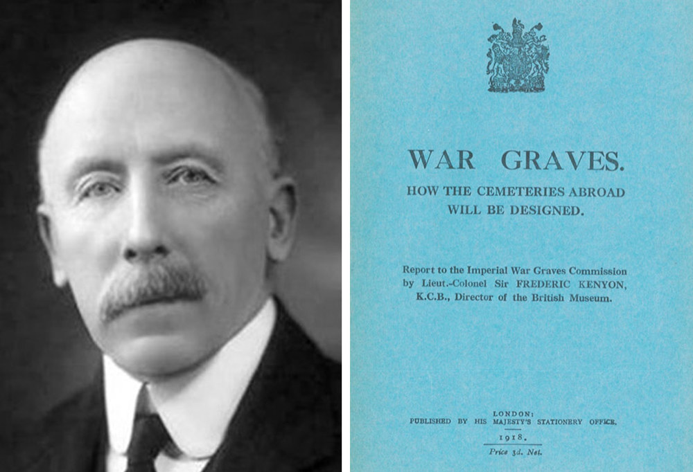
War Graves: How the Cemeteries Abroad Will Be Designed, also known as the Kenyon Report, 1918. © CWGC.
THE KENYON REPORT AND THE GRAVES OF THE FALLEN
In November 1918, the Kenyon Report was produced: it was the first formal statement of the Commission’s purpose, principles and processes. In it Kenyon expressed the hope that the “cumulative” effect of the cemeteries and memorials would express “the common spirit of the nation, the common purpose of the Army, and the common sacrifice of the individual”.
READ THE CONTENTS OF THE KENYON REPORT
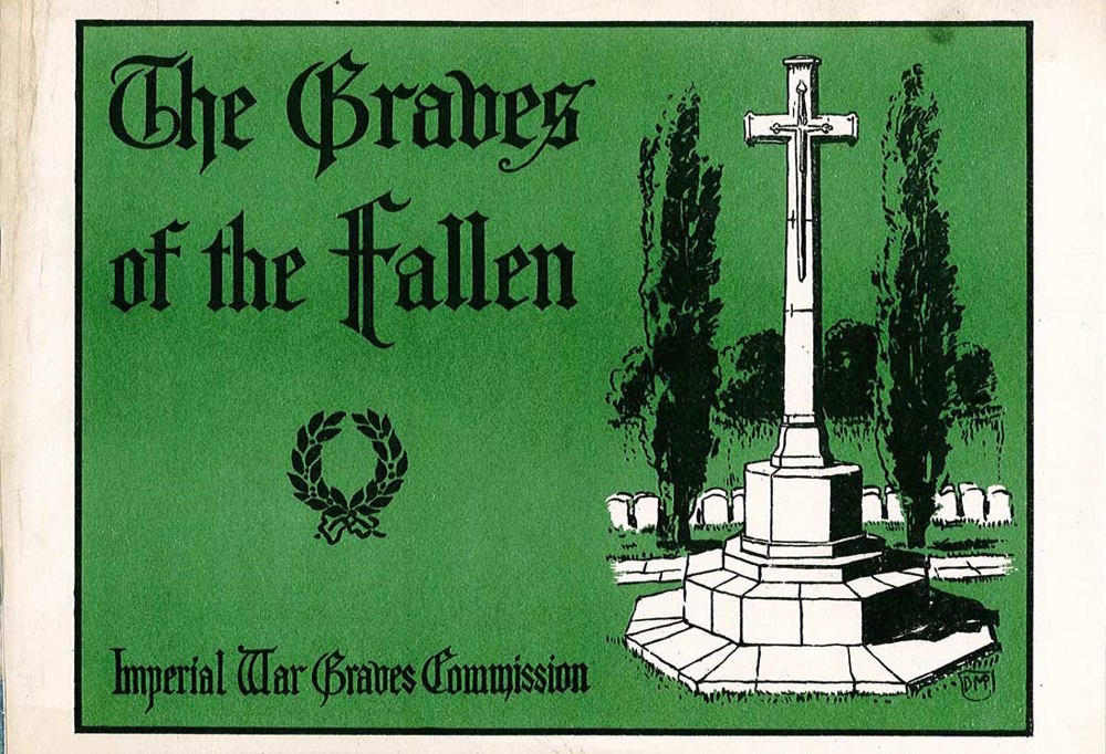
While the Kenyon Report was a useful internal document, the Commission now needed to explain to the public how its vision would be realised. There was only one man for the job: Rudyard Kipling. In 1919 Kipling wrote The Graves of the Fallen, explaining and illustrating the new cemeteries’ key features.
In The Graves of the Fallen Kipling invited suggestions from the public for designs of memorials to the missing, an issue that had not yet been settled by Kenyon’s committee. Of the many replies we received, one from bereaved mother Lina Hunter was especially poignant. She described being inspired by a “vision” she had of her son, Captain Nigel Hunter, “climbing a hill with determined face, with a half-circle of five angels behind him”.
“it was realised, above all, that each cemetery and individual grave should be made as permanent as man’s art could devise.”
Rudyard Kipling, The Graves of the Fallen, 1919
THE FIRST CEMETERIES
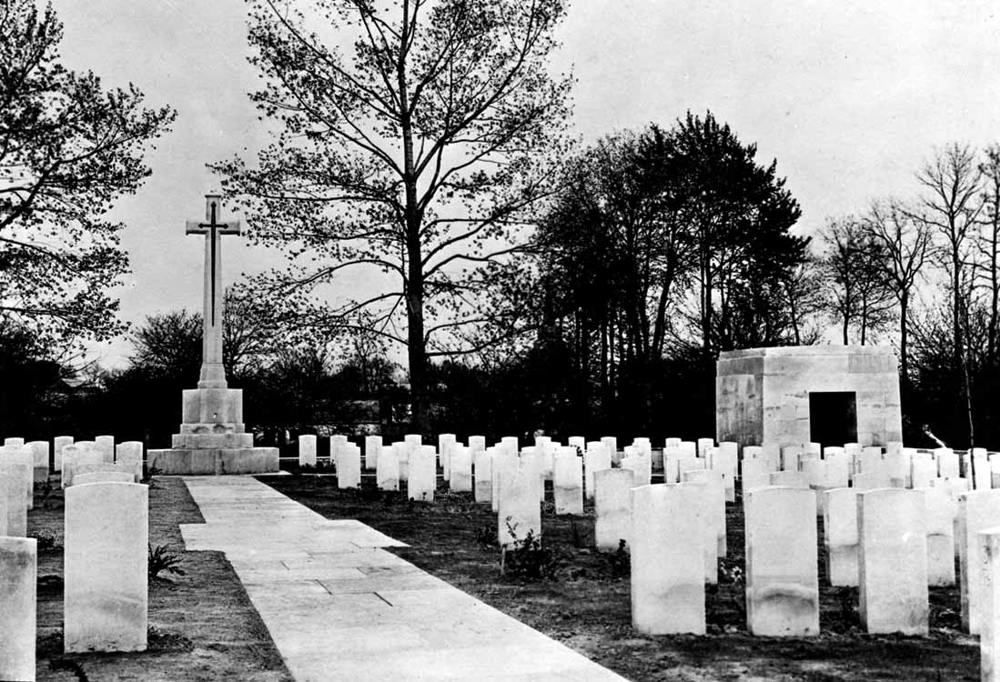
Forceville Communal Cemetery Extension, France. Part of cemetery with Cross of Sacrifice showing the shelter. © CWGC.
By 1920 three ‘trial’ cemeteries were created to test the Commission’s design principles. Forceville, Louvencourt and Le Treport were all designed by Reginald Blomfield.
Forceville was considered the most successful – a Times correspondent wrote that “it is the most perfect, the noblest, the most classically beautiful memorial that any loving heart or proud nation could desire to their heroes fallen in a foreign land”.
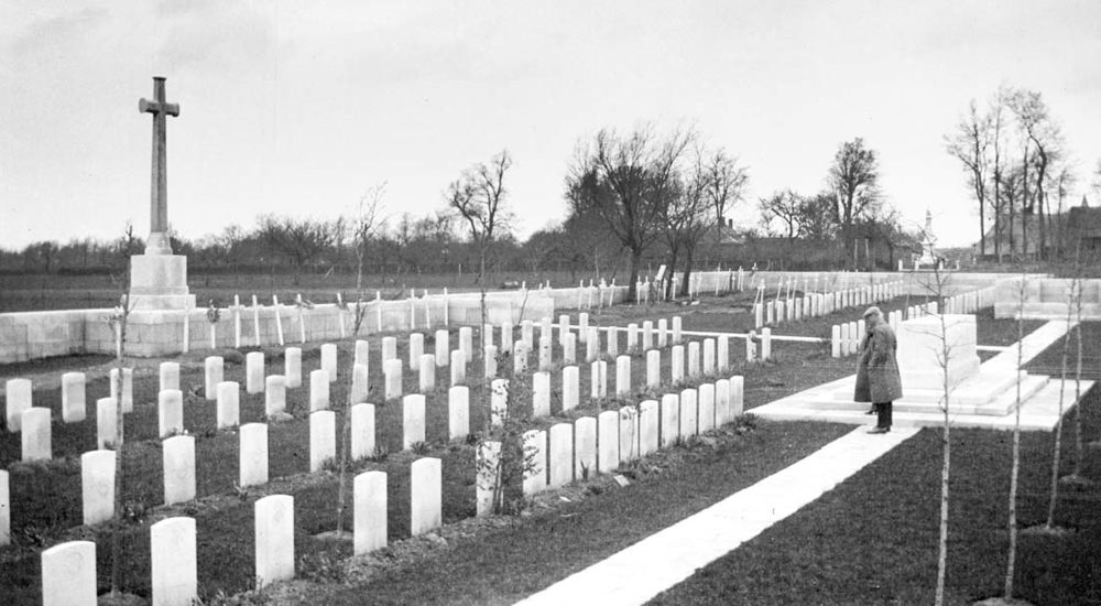
Archive photo of Louvencourt Military Cemetery, France. © CWGC.
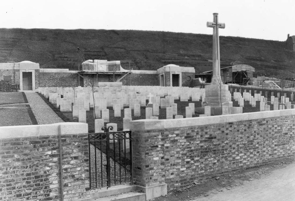
Newly completed Le Treport Military Cemetery, Goodland Collection archive photograph. © CWGC.
“The biggest single bit of work since any of the Pharaohs – and they only worked in their own country”
Rudyard Kipling
It was not only on the Western Front that the cemeteries were being built. From the UK to Gallipoli, from the Middle East to Africa, Commonwealth men and women were commemorated.


Arguably the Imperial War Graves Commission led the way in facing up to the war’s devastating effects and creating a powerful visual legacy that would ensure the conflict was never forgotten. Yet there were also accusations that creating beautiful and tranquil sites of remembrance was itself a form of denial, sanitising the brutal bloodshed of battle. The war poet Siegfried Sassoon’s scathing criticism of the Menin Gate, with its “intolerably nameless names” comprising a “sepulchre of crime”, is testament to the ire that many felt at these new forms of commemoration.
Who will remember, passing through this Gate,
the unheroic dead who fed the guns?
Who shall absolve the foulness of their fate,-
Those doomed, conscripted, unvictorious ones?
On Passing the New Menin Gate by Siegfried Sassoon (pub.1936)